Two audiences, one identity
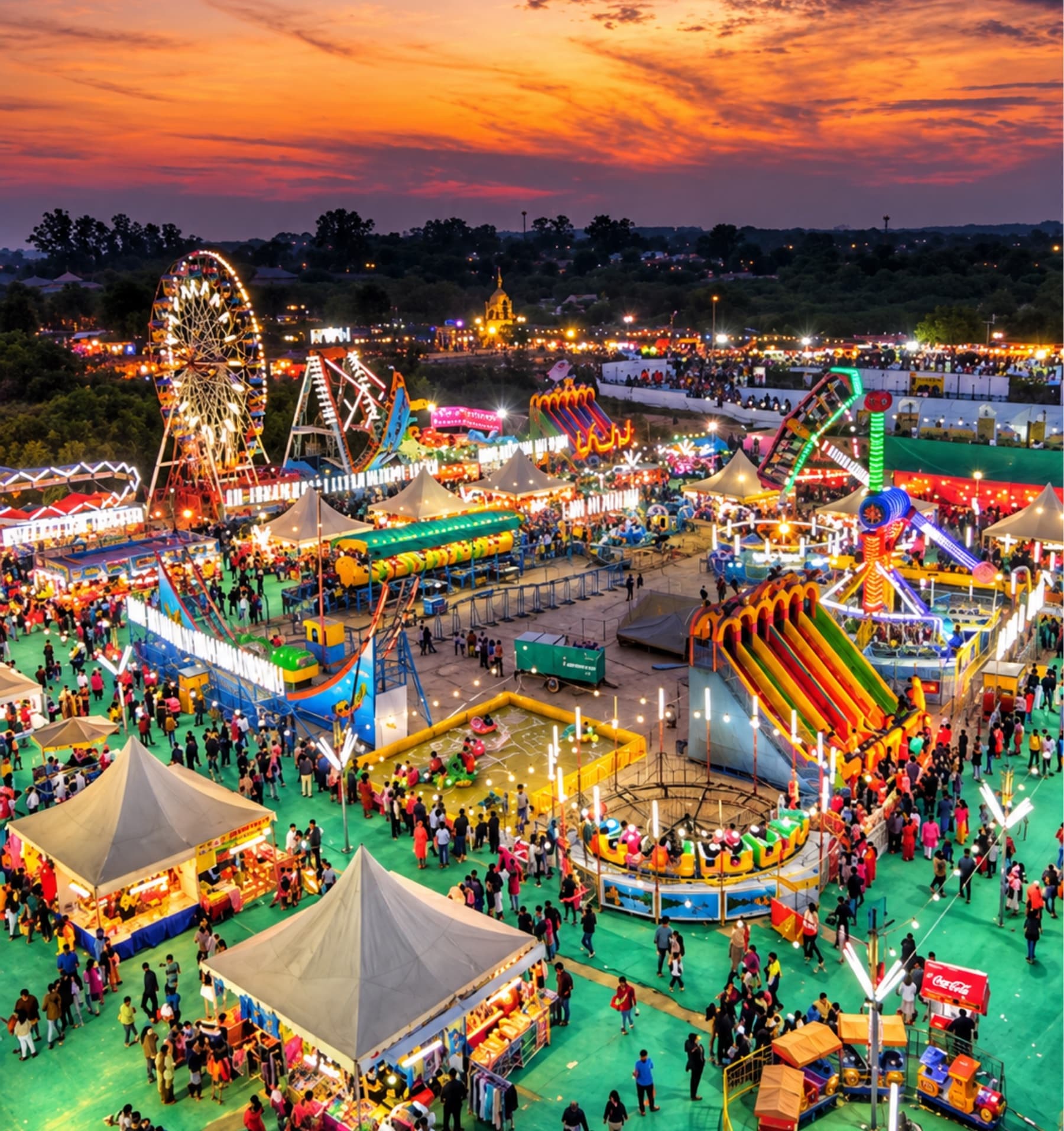
The Surajkund International Crafts Mela is India's annual declaration that the hands of its artisans are among the finest the world has ever known. It is held in Faridabad, 20 km from Delhi, in the first fortnight of February.
The challenge was to build an identity and rollout flexible enough to speak to Tier 2 and Tier 3 audiences across India, and simultaneously compelling enough to captivate international visitors - including those from partner country Uzbekistan.
Earthy, grounded, deliberate
We built the identity from the ground up, rooted in the values that make the fair what it is. A soft, earthy colour palette was a deliberate nod to the artisans whose work fills the mela; the muted tones also lend an air of sophistication, making the visual language feel grounded and centred.
A peacock feather became the visual soul of the brand - carrying beauty, pride and India.
Distribution treated as science
We took a two-pronged approach: identify which creative content was most effective, then identify which channels were most effective at distributing it. The key was strategic, aggressive testing, and SKMA built time and budget for a testing phase so we could optimise on real data.
Daily performance reports tracked which content was working, which channels were delivering, and where every rupee was generating the highest return.
Deliverables
- Visual identity - font and colour palette
- Brand voice, tone and guidelines
- Rollout strategy
- Information brochure
- Motion graphics and infographics
- Promotional assets, digital and physical
- BTL activation and testing strategy
Start a project
Ready to sail together?
Whether you’re ready to embark on a creative journey or just want to say ‘WOW’, we’d love to hear from you.
Contact us